
Workouts and Health Notes: the unfancy fitness tracker
Most fitness apps want to be your coach. KTO's health area is simpler than that: it's a fast place to write down what you did, and a set of graphs that show you what's actually happening over time. Here's a tour of the two features that carry it.
Workouts
The workout log is a plain list: one row per session, newest first, with badges showing what kind of work you did that day. You can see at a glance whether the week was strength, cardio, or a mix.
The workouts list, with type badges for each session 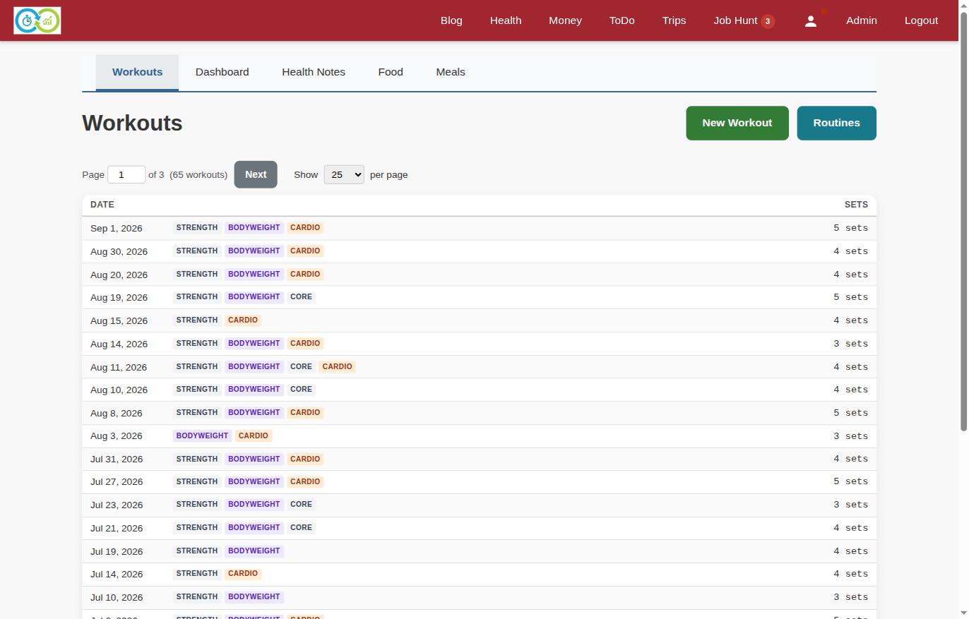
Open a workout and you're in the tracking view. Add exercises from your own library, then log sets as you go:
- Weighted exercises record weight × reps per set (150 lbs × 10, 150 × 7, 130 × 8...)
- Cardio records duration and distance per interval
- Bodyweight and core work records plain rep counts
Tracking a workout: barbell rows with weight and reps, running with duration and distance 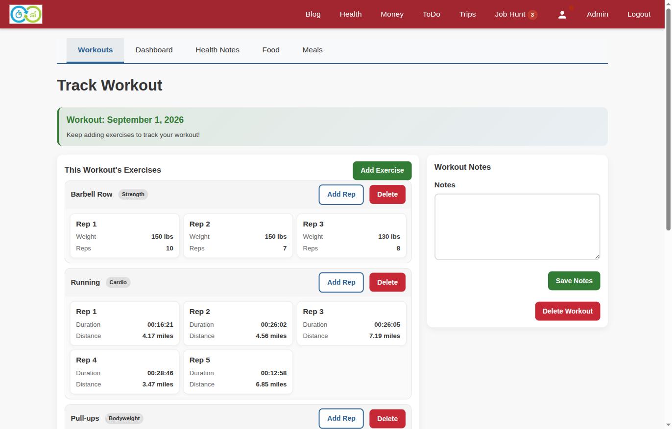
Exercises come from a routine library you build yourself. Type a name, pick a type (weights, cardio, stretching — or your own), and it's available in every future workout. The tracking form adapts to the type: cardio exercises ask for time and distance, weighted ones ask for load and reps. There's a notes box on every session for the things numbers don't capture.
Health Notes
Health Notes is the daily-metrics side: one row per day with weight, body fat %, blood pressure, calories burned, and free-form notes. Every field is optional. Log what you measured, skip what you didn't — the history is honest about the gaps.
The health notes list: daily weight, body fat, blood pressure, and calories 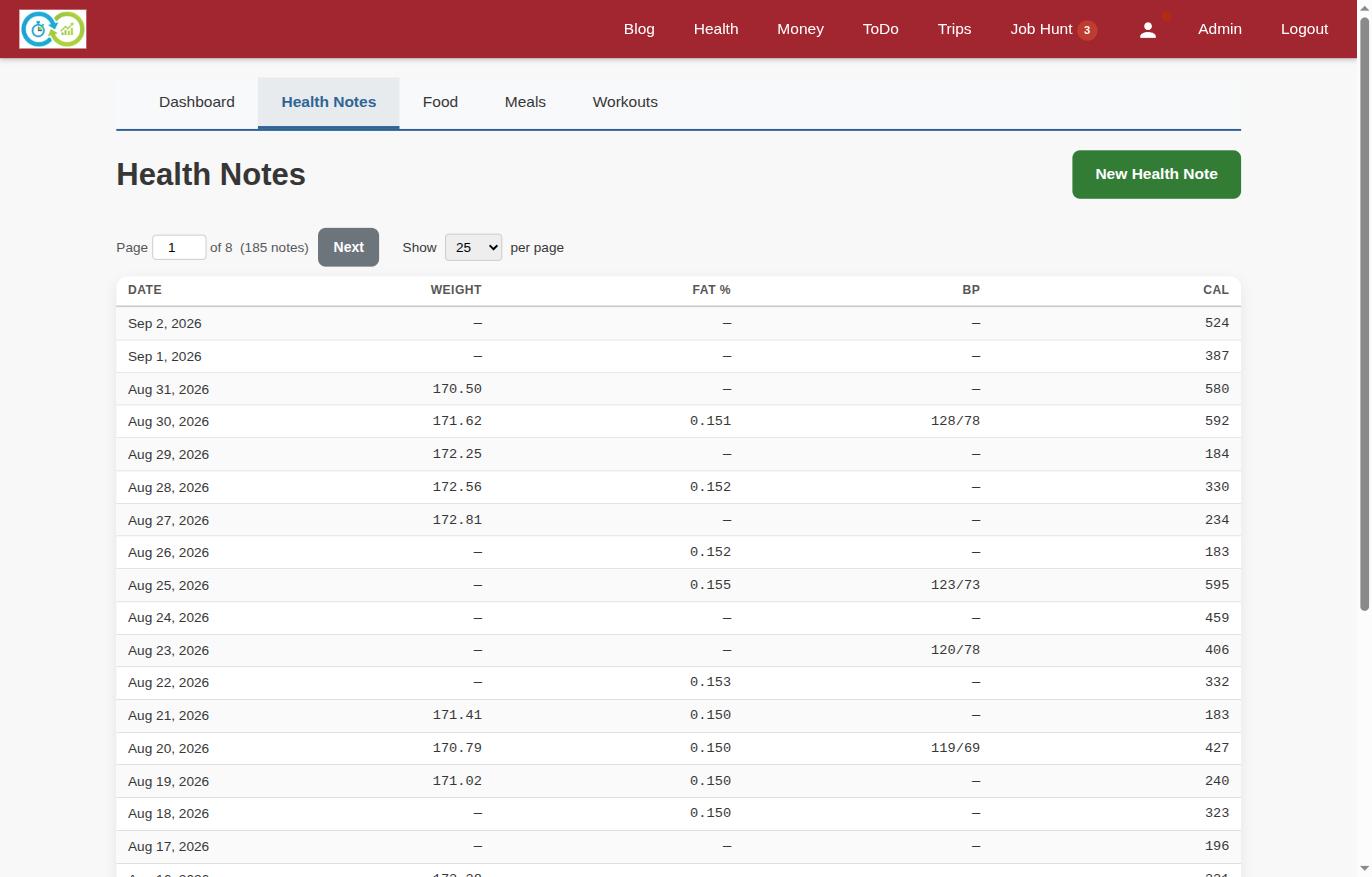
The dashboard: your metrics, your graphs
Raw rows are for entry; the dashboard is for reading. You build it yourself from widgets: pick one or more metrics, a chart type (line or bar), and a date range — last 30 days, 90 days, a year, all time, or a custom window.
The health dashboard: a weight trend line and calories in vs out bars 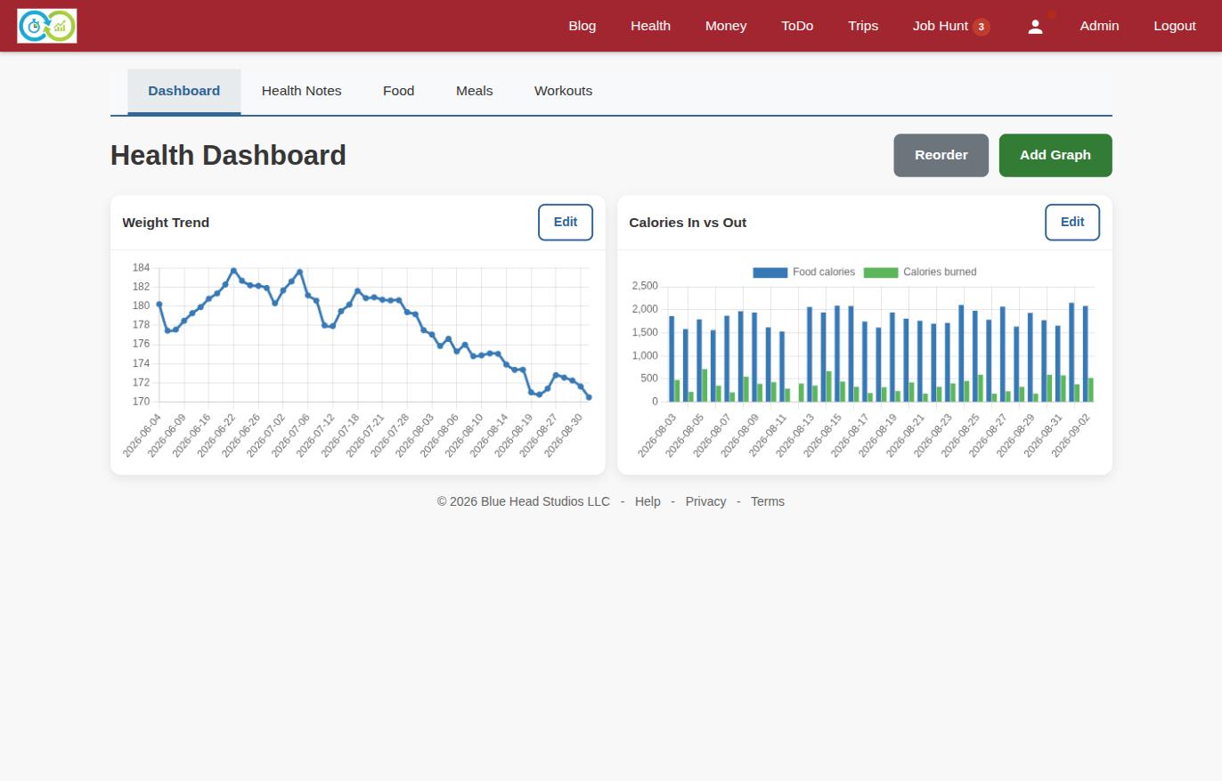
Metrics can overlay in a single chart on a shared date axis. Blood pressure automatically expands to systolic and diastolic series. And because KTO also tracks food, there's a food calories metric — put it next to calories burned and you get a real calories-in vs. calories-out picture without a spreadsheet.
Widgets drag to reorder, so the chart you check daily sits on top.
The point
Nothing here gamifies anything. No streaks, no badges, no social feed. You write down the workout, you write down the number on the scale, and six months later the weight-trend line tells you the truth. That's the whole feature — and like everything else in KTO, the data is yours to export any time.
Workouts and Health Notes live under the Health tab. Start with one health note a day; the graphs get interesting fast.